Write on your Phone
Published: 09/28/2023
Subscribe to Ja3k
That's right this blog is now a newsletter.
Thanks for subscribing!
I recently had my best tweet ever and as is customary on the internet I have to climb the gradient of engagement and eventually become a strange flat parody of myself.
Throwing my laptop in the trash pic.twitter.com/QFfHo8fims
— ja3k (@ja3k_) August 7, 2023
I originally got this keyboard [1] for a weekend trip. I booked spirit so everything had to fit in one bag. It's a pretty social trip so I wouldn't spend enough time on my laptop to make it worth the space and weight but I thought it'd be nice to have a keyboard on the plane. Do some light writing and coding.
My first impression holding the keyboard is it's an absolutely delightful object. The magnetic clasp has just the right amount of snap and the back is a satisfying leather feel. The cloth hinge gives a decent spacing between the hands while also folding thin enough that it fits in my pocket.
The bluetooth is more responsive than any headphone I've ever had for reasons I don't understand. Opening and closing actually turns it off and on. There is no switch. Perfect design. You can toggle between 3 saved devices which I imagine is nice but I can't imagine using it with anything besides my phone. The actual keyboard is nice enough that I could imagine using it for daily programming and see is as competitive with Apple's magic board but I must live a certain way.

Note these halves are so far apart that my hands are more than shoulder width apart when typing. Which I highly recommend.
Also note I chose this board because it was the cheapest split keyboard with cherry switches I could find on amazon and I'm a little peeved I couldn't find one for ~$80. It seems split keyboards aren't too popular despite being much better. It's this keyboard if you want one too. Again an affiliate link.
The bluetooth keyboard charges with USB-c so you won't need another charger.
The phone stand even came with the keyboard which even though it's just a small piece of plastic was a very nice touch. It was well designed with 5 different angles, even labeled in degrees.
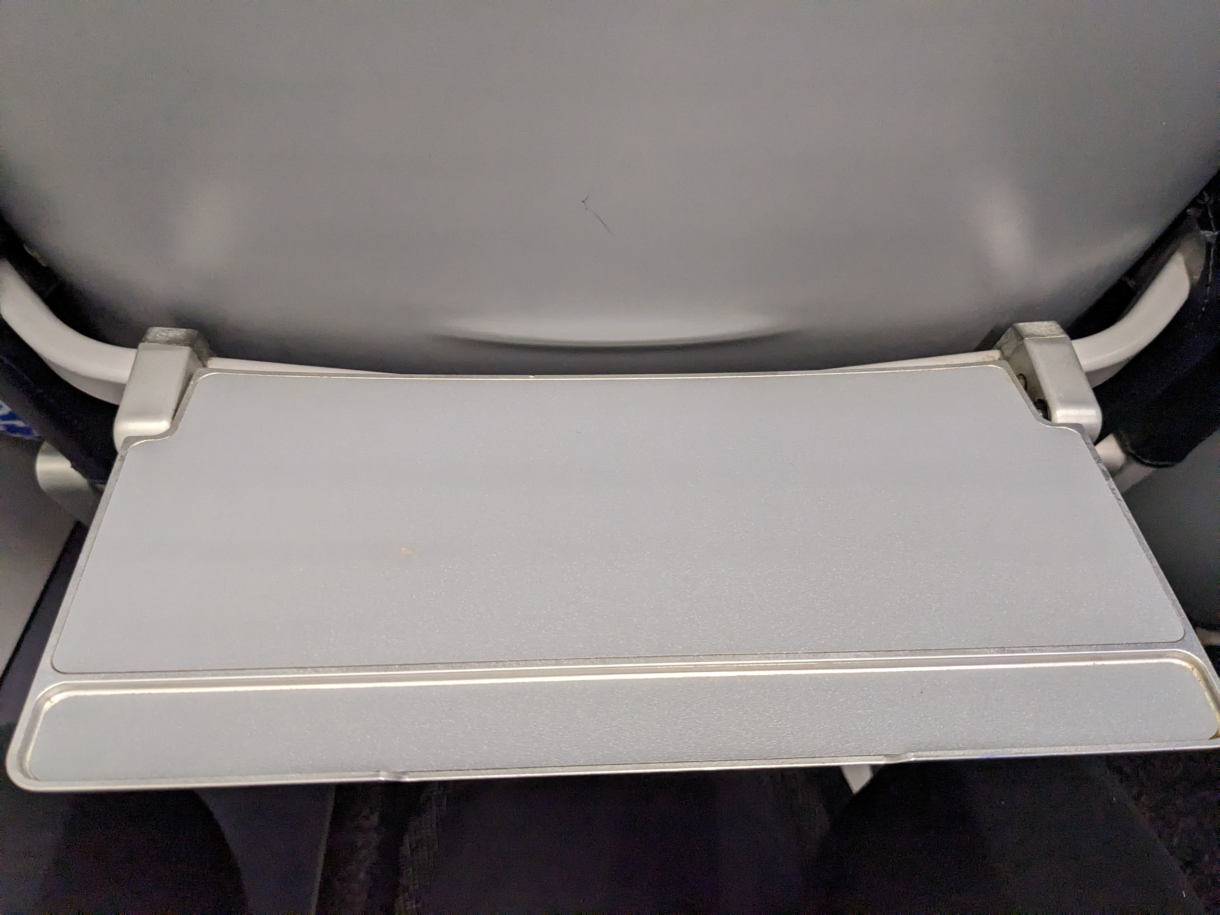
Spirit ended up having extremely small tray tables. But I was still able to write on my phone by putting my phone in landscape mode and leaning it between the keyboard and chair. I wasn't able to take a picture for obvious reasons. But it worked great. I was able to do some journaling, write a lot of a Vegas tournament report and even make some small commits to ChatVim. Unfortunately I wasn't able to install mentat because the pip install complained about some rust dependencies so I wasn't able to work on my day job. But other than that I was able to do everything I wanted to.

Some people had dumb critiques of the setup:
tHinK of yOUr eyEs
Hold your phone up to your laptop screen and compare the text size. It's pretty similar. Also it's adjustable. When writing I don't even really look at the screen. I stare off into space and only look at the screen occasionally to fix spelling and move the cursor. Which I highly recommend: there's no new information in what you're writing (to you) so why are you looking at it?
My pixel screen compares favorably to a macbook air. A macbook air has 224 ppi and 60 Hz refresh rate. My Pixel 5 has 432 ppi and 90 Hz. Also oled instead of LED backlit.
The real problem isn't eye strain it's that you can't have that many lines open at a time.
People seem to love having huge monitors which I think misses a basic truth: you can only look at one thing at a time. And in general people love to think of the things they have open in physical arrangements that maybe made sense when your documents and books were physical papers you had lying around somewhere. Once you see it you see it everywhere:
- People arrange apps on their home screen and desktop
- People keep multiple tabs open and develop workflows like "email is the leftmost tab"
- People keep lots of splits and tabs open in their editor.
You should not organize your digital information spatially but indexically!
- You shouldn't have apps on your home screen in a place you remember: you should search for apps by name (with most recent or frequent up top)
- You should not switch tabs with ctrl-tab, ctrl-l or whatever. You should find the tab you want by searching by title or url. For instance you can use Vimium and T.
- You should not have a bunch of tabs and splits open in your code editor. You shouldn't think 'I need to go back to that file over there' but I need to open the file foo.py and then use ctrl-p or some other fuzzy finder to open it with a few keystrokes.
Once you internalize these practices you'll stop feeling such a need for screen real estate.
Anyway the keyboard is great and android + it is more than enough for a weekend trip.
A word on Termux
Termux is the real star of the show. I've got node, python and clojure all ready to go on my phone. You can see me using it here. Note running things on localhost and opening it in a browser works just like on a desktop. It really doesn't feel very different from developing on Ubuntu.
Vim, Tmux, Git of course also work so there's really no difference in my developer workflow at all.
[1] As an amazon affiliate I earn from qualifying purchases. I didn't have this set up when I made my hit tweet and missed out on 30 whole clicks. That might have been as much as a whole dollar. I'm never making that mistake again.