Android is just better than iOS
Published: 1/20/2023
Subscribe to Ja3k
That's right this blog is now a newsletter.
Thanks for subscribing!
My thesis is simultaneously highly contrarian and sort of trivial. So why write this post? Because I feel so thoroughly gaslit by society. And I have to speak my truth.
Of course this thesis isn't really contrarian because android has 72% global market share and almost half in the US and the most expensive phones aren't iPhones. So maybe I'm just talking to smug iPhone users [1].
Smart phone OS has an almost religious feel to it where you choose one young, often copying your parents, and for the most part never convert or even try the other one. So it's no surprise we have true believers who are totally ignorant of the state of deprivation and abuse they are in. Until recently I also believed the Apple good design propaganda. I chose Android in 2010 because I wanted flash support and to write Java apps. Also slight price sensitivity and preference against AT&T. Four reasons which seem silly in hindsight. I always believed I had chosen a generally worse designed phones except for a smattering of technical upsides. Until I actually held an iPhone and flicked through it.
I'm going to go through the basic OS features and discuss how in almost all cases Android has better design. For concreteness I'm talking about my Pixel 5, Android version 13, and my wife's iPhone SE, OS version 15.6.1. These are both ~2 year old phones and Android and iOS have been copying each other for over a decade so maybe iPhone has closed the gap. I'll argue all of the following are better on Android: quick settings, WiFi password sharing, autorotation, alarms, notifications, home screen touch interactions, keyboard and body.
It's harder to talk about non-default apps but at least for the notes app I'll argue Google Keep is better than Apple Notes. I didn't bother to open Apple Maps but I have to imagine if they can barely get a majority on their own platform it's a lot worse than Google Maps.
I focus mostly on design here but other benefits of Android include:
- A wider more competitive ecosystem of phones. There are people experimenting at different price points and form factors and if an Android user thinks an experiment is a good idea it'll be easier for them to try it out.
- You can sideload apps so you don't have play by Google's rules if you want to use Apps they don't approve of.
I believe the only benefits of iOS are the places where Apple has deliberately made their phone not interoperable with Android. E.g. Apple messages where Apple has chosen to display Android phone users texts in a different color for no benefit to the user. But if you think of any I'll add them to my list at the bottom. (Since writing this paragraph I thought of one and put it on the bottom).
Also sorry for this very one sided thing which maybe turns into a rant at parts. I went into it writing down the list of OS features I wanted to look at and expected I'd see good and bad on both sides. But everywhere Android and iOS made a different choice iOS's seems worse.
Quick Settings
If you swipe up on iOS you get some quick settings which they call the command center. To get the analogous screen on Android you swipe down twice. The first time you see mostly notifications with your first 4 options up top and the next time you see more icons and a brightness bar.
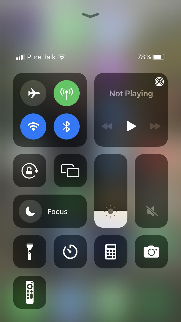
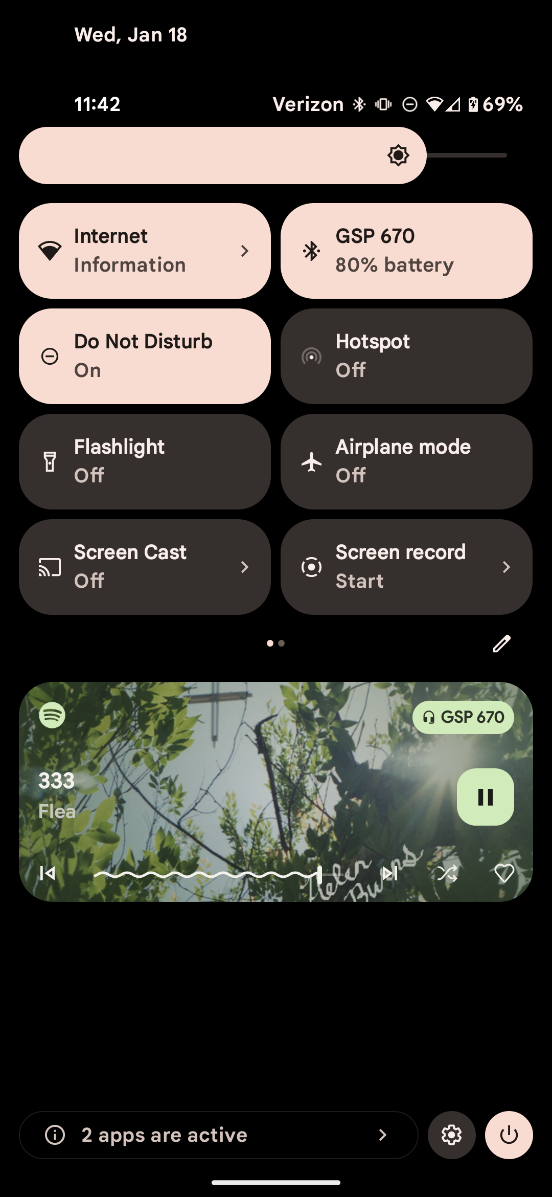
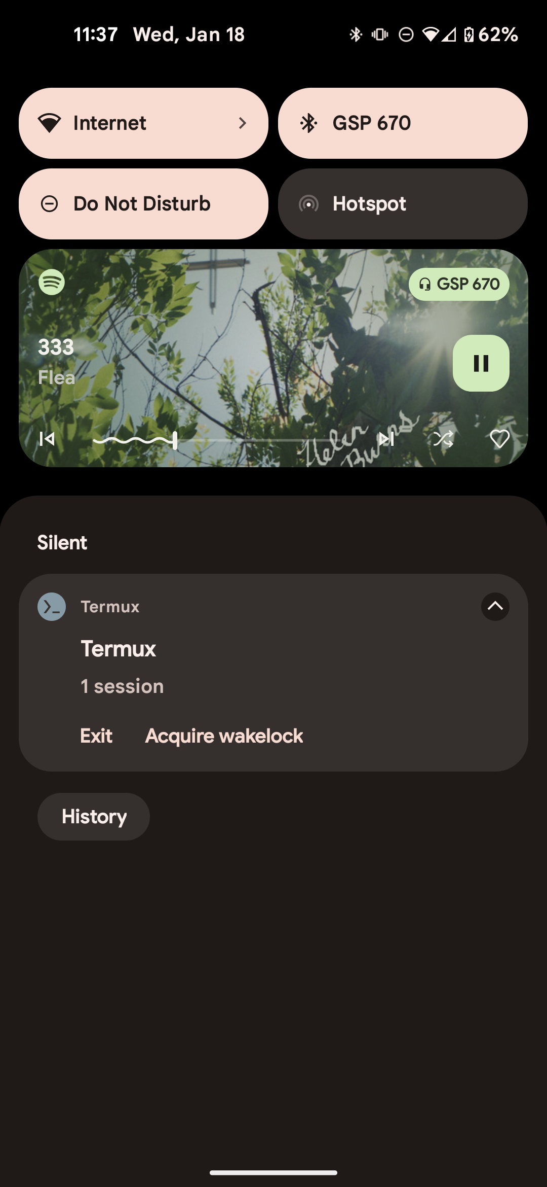
Here this is a little bit taste but I think Android's is better in a number of ways:
- I think text is good here. Some icons like WiFi and bluetooth are universal. But what do those buttons in the middle do? What are the other two networky symbols?
- Notice the now playing thing for Android is in notifications and it wouldn't be there if I wasn't playing music. Apple gives a sixth of the screen to it's now playing even though nothing is playing.
- Why is the Calculator there by default? Why the remote when my wife doesn't have a TV set up?
- On Android you can edit the shown options right from the screen. On iOS you have to go to the main settings menu. Which is not linked here. But the calculator made the cut.
- On iOS you can toggle the WiFi by clicking it. But what if you want the WiFi settings? You might think you could long press the WiFi icon. WRONG! If you long press it, the first time it expands the network box. Why? I couldn't tell you. Then if you long press it again it opens a box which shows you what network you're connected to. Seems dumb, you probably already knew that, and it said it below the WiFi symbol in the expanded box anyway. But from there there is a settings button you can click.
This brings us to:
Wifi Password Sharing
I'd tell you how to do it on iOS but I actually couldn't figure it out. I gather from googling that the first step is to have the other device ask first? And it has to be an Apple device? Seems insane? What if you want to write it on your fridge? Or connect a non Apple device? Maybe if you're hell bent on this system you should explain it in WiFi settings?
Android has a large "Share button" right on top. It asks you to re-confirm your identity but then shows you the password in plaintext along with a QR code.
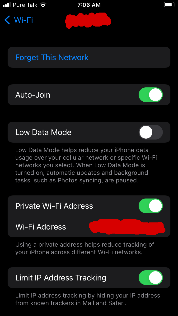
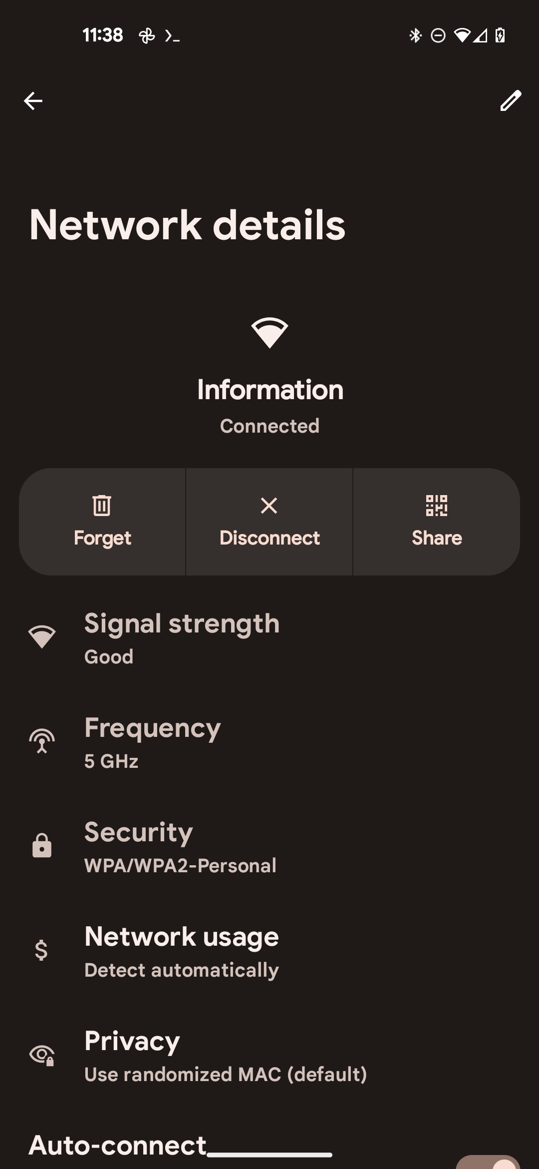
This one has actually bit me in the past where my wife couldn't share a password with someone so I had to do it. At the time I thought we were missing something but I guess it's just hard.
Autorotate
Another setting done way better by Android is auto rotate. They mostly operate the same between the OSes but on Android when you have autorotate off and then rotate your phone a little button appears in the corner asking if you want to rotate.
I really appreciate this feature because when I'm reading in bed I don't want the phone to rotate but occasionally, like when watching a video, I want to switch to landscape. The prompt is a nice in between.
Alarm
When you set an alarm in iOS the input modality is a scrolling rolodex.
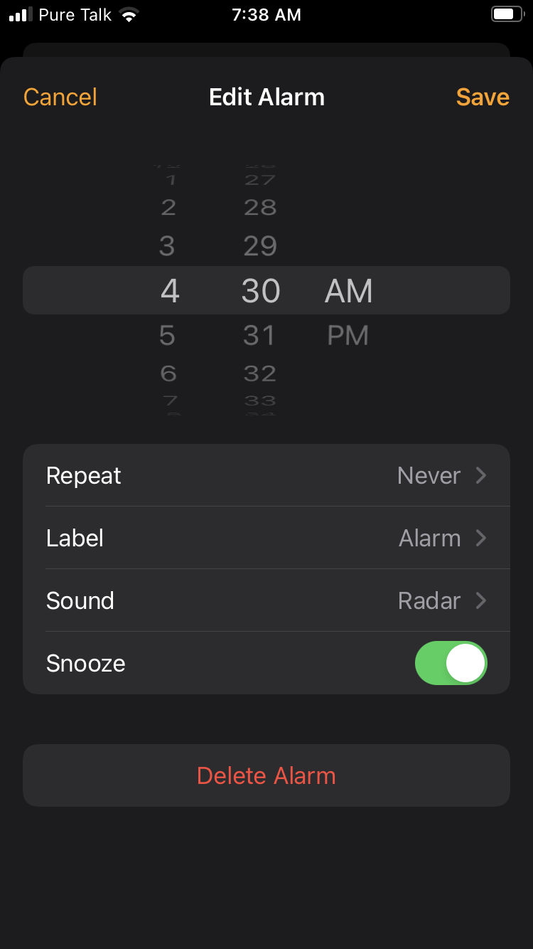
This leads to the fairly insane property that it takes longer to set an alarm for certain times [2]. This explains something that's always baffled me: In iOS screenshots you often see the user has set many alarm times with them mostly off. I guess this saves time verse making a new alarm.
On Android it's a clock face.
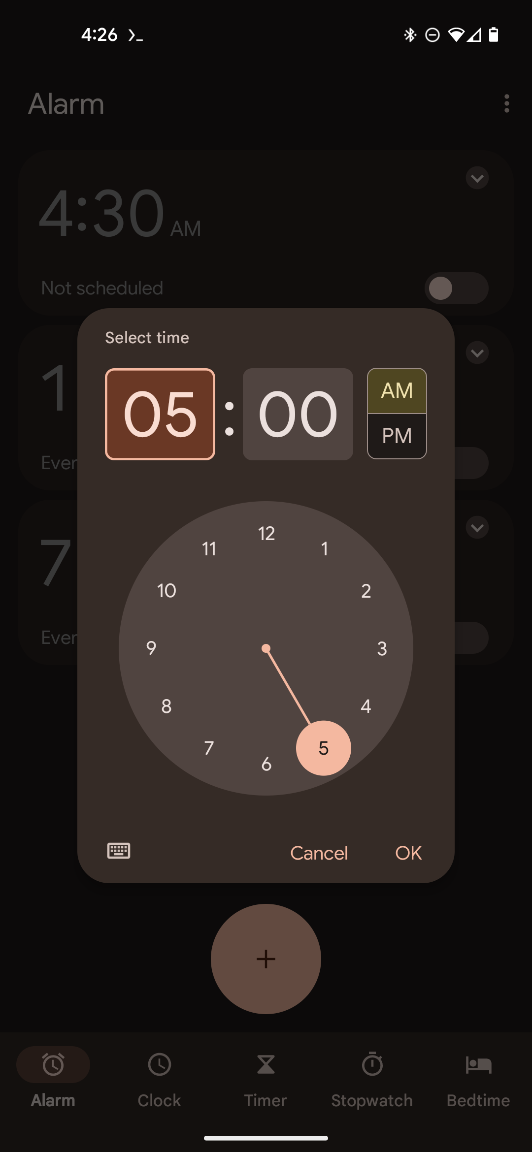
Don't like this input modality either? Notice Android has a handy keyboard icon to switch to typing. And yes if you click it the clock will remember and present it next time.
Another great upside of Android here is when you set an alarm it appears and is dismissable from your notification's tray. On iOS there's a tiny icon by the battery but you have to open the app again to see when it is or cancel it.
Notifications
An incredible feature I use on Android all the time is muting notifications by type from an app. On Android you can long press a notification and mute notifications from the app right there. Not only that you can mute types of notifications. Want to mute the annoying promo notifications but still get the messages you can respond to? You can on Android but not on iOS. If the app is nice maybe there's some internal menu you can hunt down that will let you. Sounds painful.
Home screen
If you long press the Apple home screen the app icons start wiggling and get a minus in the upper right indicating you can move them. This is strange for two reasons:
- You can already move any app by long pressing it. Though on iOS this interaction is really poor: If you long press, a menu may appear depending on the app (e.g. the notes app may open a menu with a quick "New note" button) but if you keep holding for a half beat after the menu appears it will disappear and the icon enters a drag state. On Android the menu doesn't disappear until you start dragging [3].
- Why does the minus indicate moveability? I guess it indicates removeability?
If you look carefully on iOS there is a tiny plus in the upper right, easy to miss, which lets you add widgets.
On Android you get a nice menu which lets you:
- Add widgets
- Change the wallpaper. To me this is the big important one that users will actually want to do frequently.
- Update common home settings
Keyboard
The keyboards are mostly the same (come on it's a keyboard) but I will note on iOS if you enter the emoji part of the board, which is confusingly hidden behind a globe, I guess indicating it's using the internet, much less clear than Android's smily face, and then close the keyboard, you'll still be in that part when you next open the keyboard. Part of the reason I think this is really confusing is because the button to go back is again the globe, not like Aa, as it is on Android.
I also appreciate that Android puts the keyboard settings right there on the board if you want to tweak anything.
Body
It's 2023 and all phones are basically the same. But still somehow when they come apart in design I can't help but feel they are making horrible choices.
Charger
Pixels and most Android phones use USB-c which has the advantage of being far more universal than lightning. So universal Apple themselves made a laptop with only USB-C ports [4]
This won't be an Android advantage for long because the EU is making them use USB-C. Honestly, I'm slightly against this because it seems not future proof and in general what does the EU know about the best ports? But in this case it's so obviously in the great interest of consumers it's hard to be too against it.
Fingerprint reader
I'm comparing to the SE which still has a fingerprint reader. Their higher end ones have face id. I can't help but think the reason they needed to move away from fingerprint readers is they were putting them in the wrong place? Pixels put them where your index finger naturally rests on the back making unlocking seamless. The SE puts it at the base of the phone. It's easy to move your thumb there even one handed but it isn't where it naturally rests.
Notes vs. Google Keep
Honestly they are both fine and fairly similar. I could see the point of view of someone who prefers Notes' aesthetic. But there are a number of ways I think keep is better:
- Both have websites which make it easy to use between a computer and phone. But notes has the boomer design with folders and only those nested below "iCloud" sync.
- Keep has the amazing feature that you can have a note notify you at a specific time and place. Want to get a reminder the next time you go to the store? Or want to make sure you see your todo list when you get home? Or want to remember to do your taxes next month?
- Keep's share notes feature actually works. It'll send an e-mail when you enter one as collaborator and also has a nice "groups" feature. When I tried to share a note on the mac desktop app it asked me to choose an "E-mail provider" ... what? And when I did it on the web client it simply never sent an e-mail. To be fair Note has an impossible job here because not everyone can make an apple account, you have to buy a product first, whereas anyone can make a Google account so Keep can send a more helpful e-mail.
But for the record I do prefer Keep's aesthetic. The new note button is much larger and more noticeable:


Keep's search is stickied to the top as you scroll. Apple basically never stickies the search bar. Android has it stickied on the: settings, app search page [5] and keep. None are stickied on iOS. But when you've scrolled for a few seconds and not found what you want is when search is most valuable.
The one upside of Notes is you can mix formatting to have in note headers and bullets. I'll note the Google Docs app is great though probably no one uses it.
Apple Upsides
Feel free to let me know where Apple is better. I'll add things to the list as I hear them (with credit unless you request otherwise). The only place I saw was:
- Safari's URL bar is at the bottom instead of the top making one handed use easier. This is a new change and I hope Android copies it.
[1] I still see tweets like this which is sort of the attitude I'm pointing at. Though he might have been joking. Looking for this tweet I realized he complains about iPhones a lot and almost none of his complaints are true of Pixels.
[2] The first time I saw this input modality was actually on my Fitbit Versa and I remember thinking "wow, what a shitty way to do it". Now I know who they were copying.
[3] Another confusing long press thing: on both iOS and Android you take a screenshot by clicking two buttons simultaneously. On iOS the screenshot will not take until you release whereas on Android if you hold for a long press it still takes.
[4] Though I believe this was widely panned as it's not that universal. I actually have one for work and kind of like it. But I already had a handy usb-c to hdmi + 3 usb ports adapter.
[5] There's also a very useful setting on Androids where you can have the keyboard automatically open. It also searches within apps if apps expose things like contacts or messages. Though here I have a big complaint for Android: It used to be that if you clicked enter it would click whatever was on top but now it does a google search. Horrible. Some pm had to increase search traffic by 0.0001% I guess. It's important to remember all software sucks. Some just more than others.